I ran the homelab dashboards worth running. None of them would ever be mine, so I built the one that was.
A weekend build, directed end to end, in my own design language, nothing extra. It doesn't just show status, it tells me in plain English what actually needs my attention.
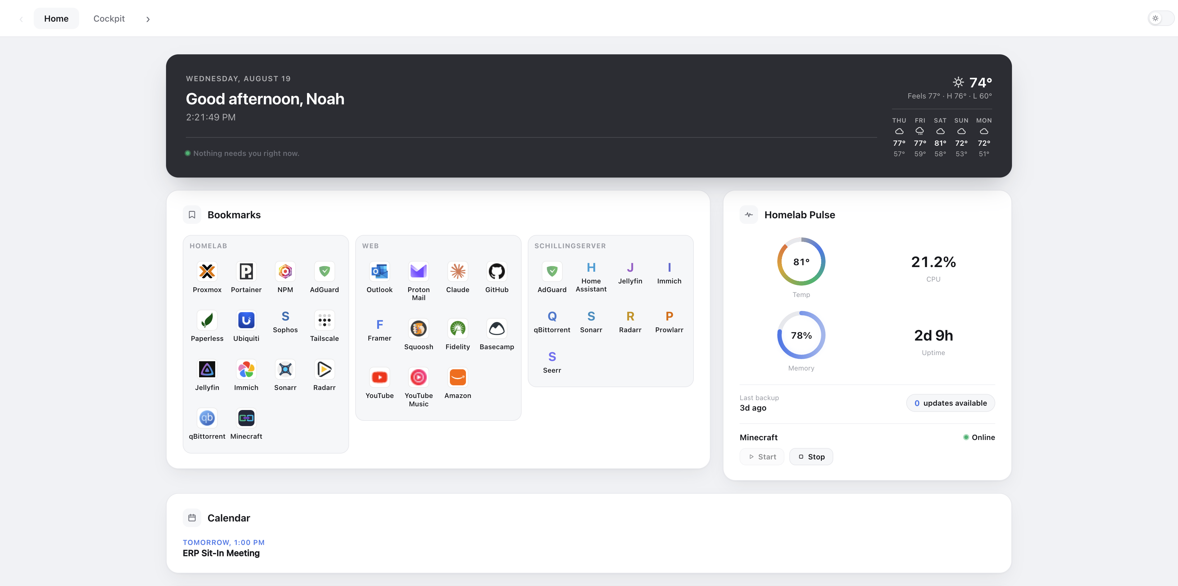
The dashboard I had worked. It just wasn't mine.
I was already running a full homelab dashboard, a clean bookmark grid with a few basic status widgets. It worked fine. Before touching a single line, I actually ran the popular alternatives myself and lived with them for a while, trying to find one worth switching to instead of building anything. What kept nagging at me was the same thing every time: these are built to run on thousands of setups they've never seen, so they're built to whatever works everywhere, not to what works for me specifically. None of them could start or stop a specific VM because I texted it to. None of them could text me when something actually broke, or tell me a container had quietly fallen behind on updates. I don't think anyone forgot to build that in, I think it's just not really an option when you're shipping to a stranger's homelab instead of your own. Once that clicked, the choice got a lot simpler: keep adapting someone else's generic tool, or just build the thing for exactly what I run and how I actually want to be told about it.
Everything the old dashboard did, plus a layer that actually tells me what matters, plus my own design language, minus every bit of bloat I never used.
Ran the popular self-hosted dashboard tools directly before deciding none of them were worth adapting instead of building.
Most dashboards show you data. Mine manages it.
Every homelab dashboard shows status: a green light, a red light, a wall of numbers. Mine watches everything running underneath it, servers, backups, containers, storage, and writes a plain-English verdict: calm, or exactly what needs a look and why. When everything's fine, it says so quietly and gets out of the way. Color only shows up when a problem has actually earned it, and the verdict is never color alone, always plain language too. That's a real accessibility call, not a style choice, nothing important here is readable by color vision alone. It's a permanent feature of the finished dashboard, running every day, not a build tool that disappears after launch, and it's the one thing none of the off-the-shelf options ship with.
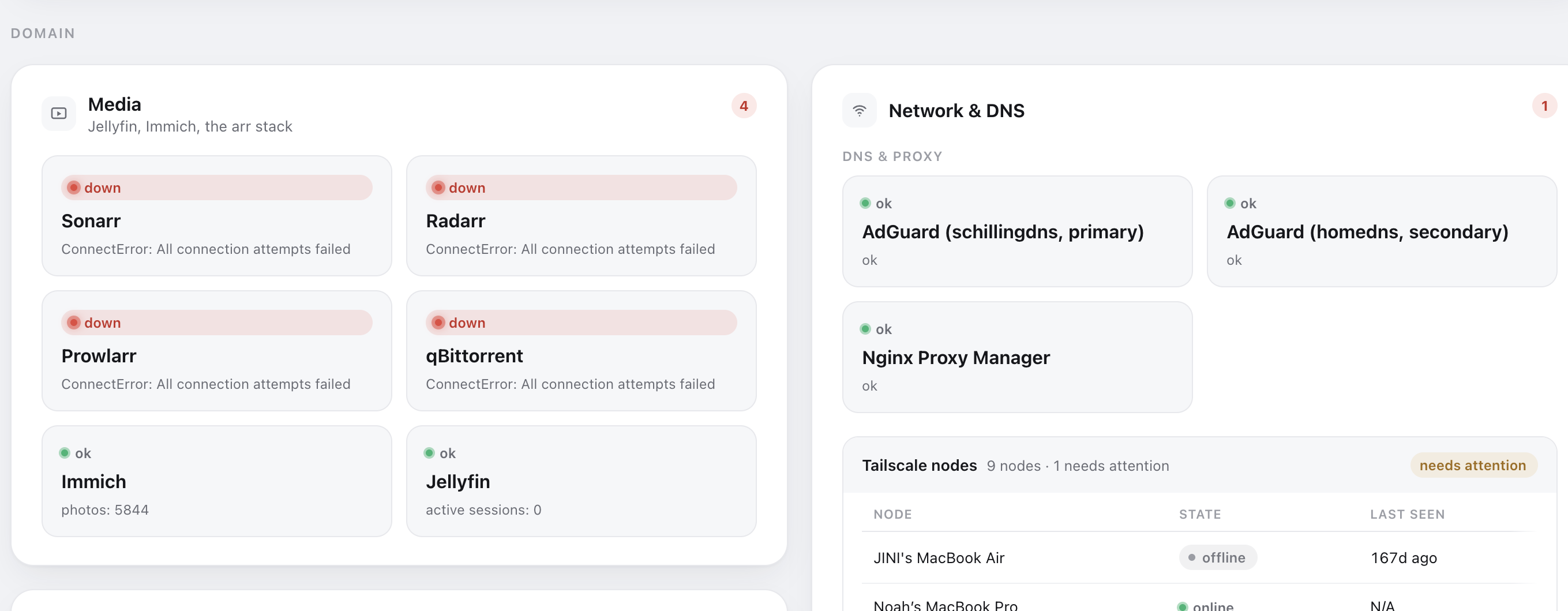
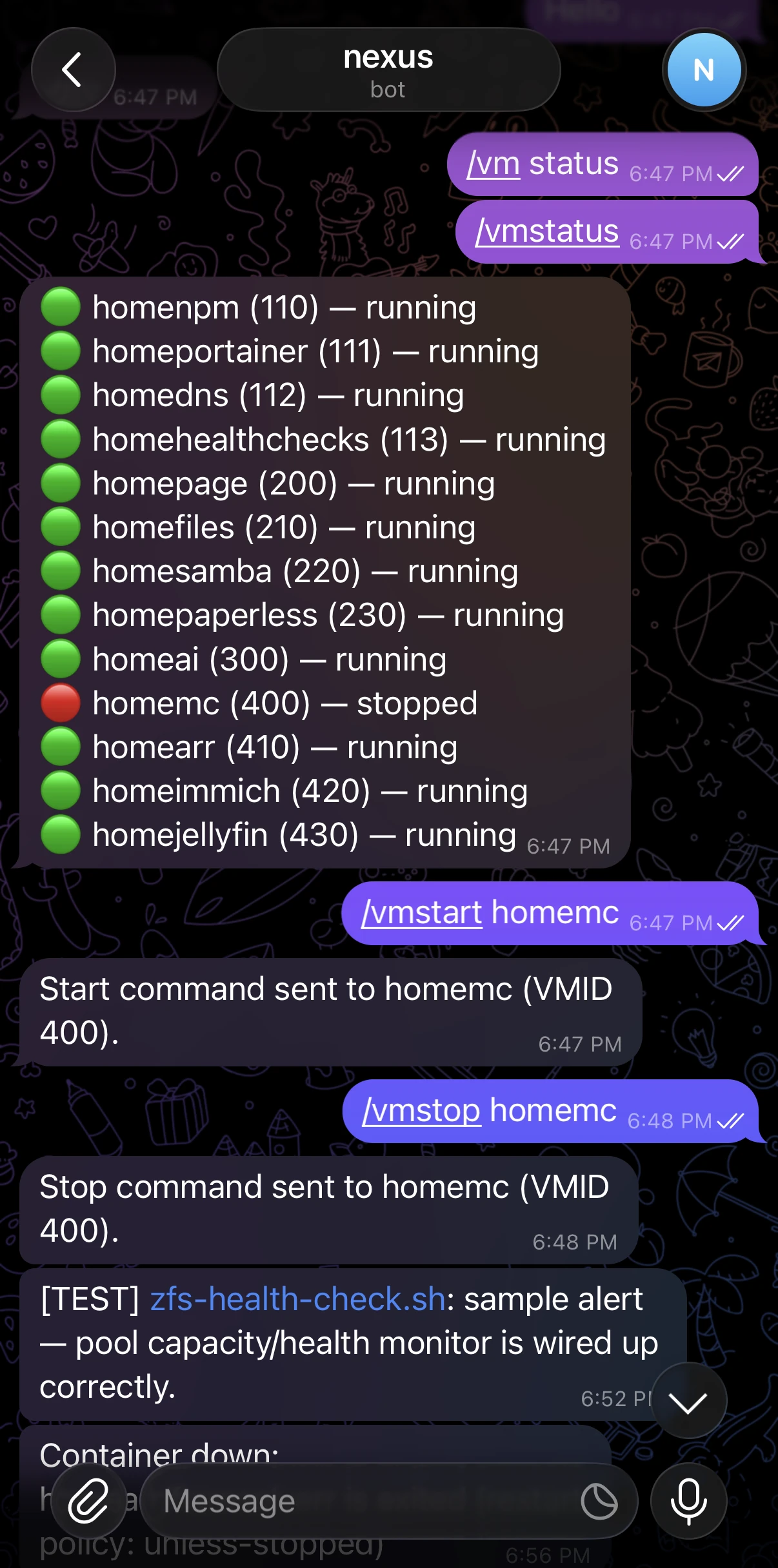
It doesn't stop at watching, either. I wanted it to start or stop a specific VM because I texted it to, page me the moment a backup job or container actually needs attention instead of me remembering to check, and flag when something in the fleet has an update just sitting there. That's not a plugin idea I bolted onto someone else's dashboard, it's honestly just what I wanted for myself, and building it myself was the only way to actually get it.
I asked for a second opinion. Reviewers made real upgrades.
Partway through, I had two AI reviewers critique the live dashboard under different lenses: one purely visual, one purely how I actually use it day to day. Both had to actually go look at the running app, not just reason abstractly. Both came back with specific, uncomfortable findings, including one that caught the dashboard quietly breaking its own rule that color only shows up when it's earned. I didn't act on any of it automatically. Every recommendation went through the same question as everything else in this build: does this actually serve how I use it, or is it just noise.
Same standard applied to the build itself. An early layout that looked clean in a screenshot was actually hiding real dead space, a grid stretching every panel to match its tallest neighbor. Caught on a live look, not a report, and fixed before anyone but me ever saw it.
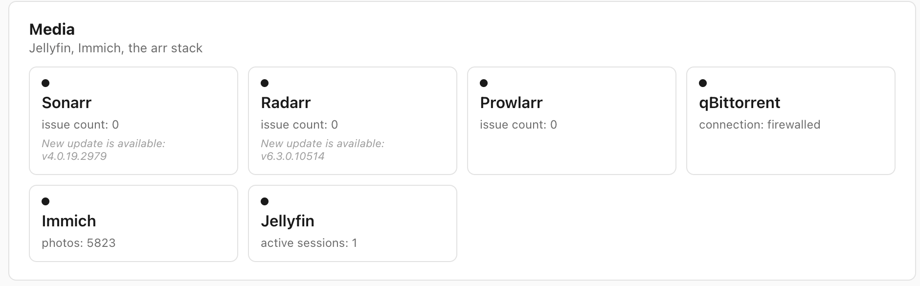
Looked clean in a screenshot. Live review found the dead space a static image didn't show.
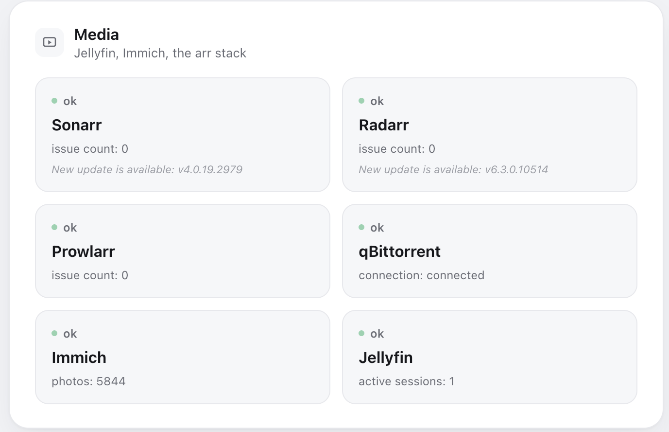
Fixed and re-verified against the same uneven real data that exposed the problem.
Live, every day.
It replaced the old dashboard the weekend I shipped it, and I've opened it every morning since. Everything I need to run my server and network is right there, a text or a couple of clicks away.